Learning PowerBI
Plant Co. Performance Dashboard.
An example dataset from a fake company that sells real plants.
The dashboard is interactive, so please click through to satisfy your curiosity (tip: the embedded dashboard can be resized to fit your full screen in the lower right corner).
Example Analysis:
October '23 year to date was less profitable than '22 by $0.15M:
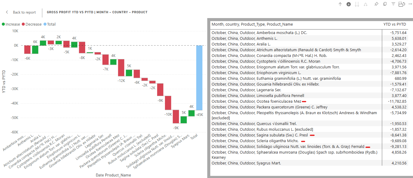
Focusing on the Gross Profit Year to Date (YTD) vs Prior Year to Date (PYTD) Waterfall Chart for 2023.
It looks like October was our worst performing month relative to last year - we want to know why so we can make decisions to increase profitability next year.
First, hover over and then click on the “Click to turn on Drill down” arrow (1). Then click on the red bar for October (2).
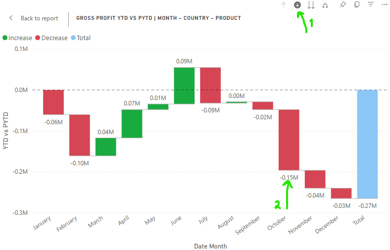
This waterfall chart has drill down information about country and product - when clicking on October, the first layer of detail shows us a list of all countries and their relative gross profit between 2023 and 2022. Here we can see 79k of the $148.41k less profit in 2023 came from accounts in China. This is reflected across all visuals in the dashboard and hovering over points/bars will show you more information.
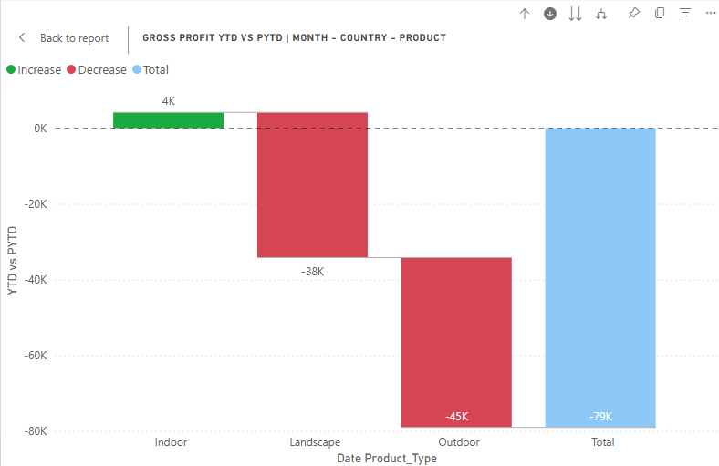
Drilling further down by clicking on china we get a grouping by product category: Indoor, Landscape, and Outdoor.
It looks like in 2023 we made less money on Outdoor and Landscape products than in 2022 but are making small improvements on Indoor products profits. Remember, at this point we are drilled down on “Gross Profit YTD (2023) vs PYTD (2022) for October 2023, from China.”
Focusing in further on Outdoor we can get an idea of which specific plants are experiencing lower gross profits in 2023. For example, 4 of these products had $9-10k less gross profits in 2023 than 2022 - something definitely worth looking into more. (and we would repeat this for Landscape).
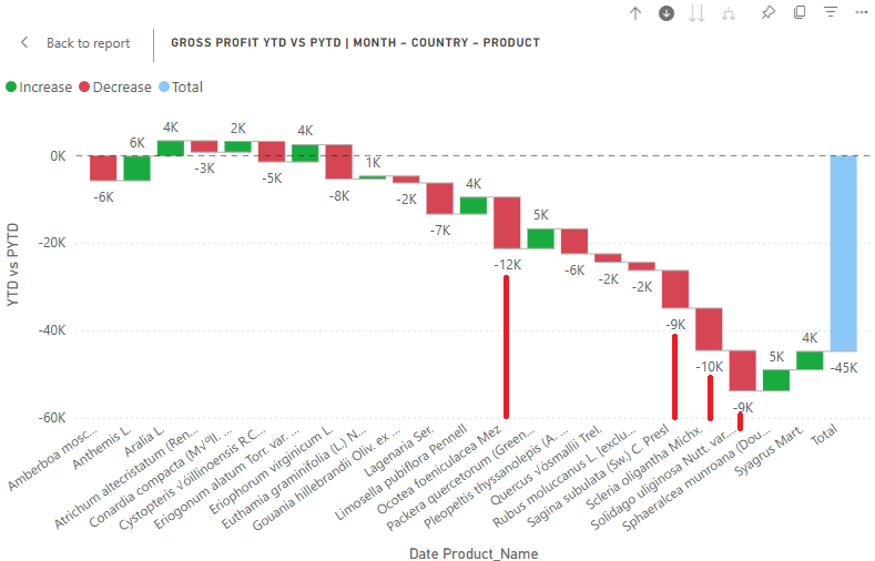
To get a final list of the products we can just request a table view by right clicking on the graph. Tip: Use portrait or landscape view to (because, yeah, reading long names from angled bar titles isn’t great)
Remember - this does not mean the products LOST money, it just means relative to last year they made less. So, maybe the products are falling out of favor in china, or maybe in 2022 there was an issue with these. It could also mean that the products are more perrenial, and in 2022 companies bought all the needed. So, when thinking about the next year we could update the catalog to offer products that are in more demand and produce less of the products out of demand for the chinese market.
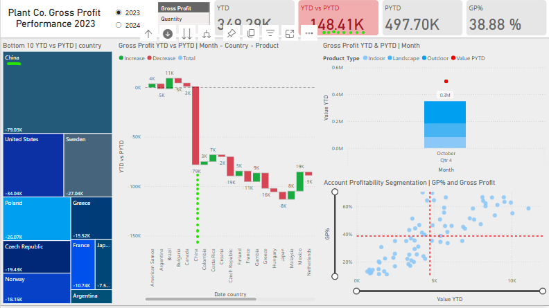
We could also look deeper at the account profitability segments, and try to advertize to the accounts related that are low value YTD, but high GP% (bottom right figure of the dashboard).
How this was made:
Project Introduction and Data Cleaning
This project was created following Mo Chen’s Power BI Tutorial.
The goal was to create a performance reporting dashboard for a company that would dynamically interact with user input. This type of tool is invaluable to businesses looking to better understand their sales and strategize for the future.
The Steps involved were:
- Data gathering (power query, virtual tables)
- Modeling - Measures, calculated columns
- Visuals - Layout and Design
- Review and Publishing
Data sources:
- Excel Workbook with 3 Sheets:
- Plant FACT (date, product id, quantity, price, cogs, account id)
- Accounts (account id, country, master id, lat/lon, postal code, street name)
- Plant_Hierarchy (product family, group, name, size, type)
Power Query:
- Data was imported into Power Query for Transformation.
- Column names were cleaned and deduplication was run on any primary keys.
- Table names were cleaned and identified as FACT or DIM tables
Data Model:
- New Table for Dates - This will be a major way we slice the data for analysis. Includes Date Hierarchies!
DIM_Date = CALENDAR( DATE(2022,01,01), DATE(2024,12,31) ) - A boolean to check if the FACT_Sales row is before or after the sliced date (will be true for PYTD)
inPast = VAR lastsalesdate = MAX(FACT_Sales[Date_Time]) # Finds the most recent sales date in FACT_Sales VAR lastsalesdatePY = EDATE(lastsalesdate, -12) # Calculates same date 12 months earlier RETURN DIM_Date[Date]<=lastsalesdatePY # TRUE for any date in DIM_Date that is before latest sales date from prior year - Slicers:
Table of Slicer Values as “Enter Data” Type
“Sales”, “Gross Profit”, “Quantity - Joins
- FACT_Sales.Account_id = DIM_Account.Account_id
- FACT_Sales.Product_id = DIM_Product.Product_Name_id
- FACT_Sales.Date_Time = DIM_Date.Date
DAX Measures: (always applies to the interval/date selected)
COGs = SUM(FACT_Sales[COGS_USD]) # Cost of goods sold summed
Quantity = SUM(FACT_Sales[quantity]) # Quantity of units sold
Sales = SUM(FACT_Sales[Sales_USD]) # Sales amount
Gross Profit = [Sales] - [COGs] # How much is made before EBITDA
- PYTD_GrossProfit =
  CALCULATE( # shifts filter context to the same period in the last year (ex oct 22 if looking at oct 23)
    [Gross Profit],
    SAMEPERIODLASTYEAR(DIM_Date[Date]),
    DIM_Date[inPast] = TRUE
  )
- PYTD_Quantity =
  CALCULATE(
    [Quantity],
    SAMEPERIODLASTYEAR(DIM_Date[Date]),
    DIM_Date[inPast] = TRUE
  )
- PYTD_Sales =
  CALCULATE(
    [Sales],
    SAMEPERIODLASTYEAR(DIM_Date[Date]),
    DIM_Date[inPast] = TRUE
  )
- YTD_GrossProfit =
  TOTALYTD( # Sums the gross profit from the start of the year to the current context
    [Gross Profit],
    FACT_Sales[Date_Time]
  )
- YTD_Quantity =
  TOTALYTD(
    [Quantity],
    FACT_Sales[Date_Time]
  )
- YTD_Sales =
  TOTALYTD(
    [Sales],
    FACT_Sales[Date_Time]
  )
- S_PYTD =
  VAR selected_value = SELECTEDVALUE(SLC_Values[Values])
  VAR result =
  SWITCH(
      selected_value,
      "Sales", [PYTD_Sales],
      "Quantity", [PYTD_Quantity],
      "Gross Profit", [PYTD_GrossProfit],
      BLANK()
  )
  RETURN result

- S_YTD =
  VAR selected_value = SELECTEDVALUE(SLC_Values[Values])
  VAR result =
  SWITCH(
      selected_value,
      "Sales", [YTD_Sales],
      "Quantity", [YTD_Quantity],
      "Gross Profit", [YTD_GrossProfit],
      BLANK()
  )
  RETURN result
- YTD vs PYTD = [S_YTD] - [S_PYTD]
- GP% = DIVIDE(
    [Gross Profit],
    [Sales]
)
Visualizations:
- Treemap chart - Month and Country by YTD vs PTYD
- Waterfall chart - Month, Country, Type, Name by YTD vs PYTD
- Line and Stacked Column chart - Quarter/Month by Value YTD (col) and Value PTYD (line) by Type
- Scatter chart - Value YTD vs GP% by Account - with segmentation through average lines
Layout and Final Touches:
- Sort Measures by YTD or PYTD
- Organize Measure Switches Folder
- Build a background in powerpoint and use it as a PowerBI background image.
- Transparent backgrounds, rounded corners, conditional formatting
- Final fixes on titles and dynamic titles (uses
SELECTEDVALUE(SLC_Values[Values])) _Column Title _Report Title _Scatter Title _Waterfall Title