Data Science Salaries
Finding myself in an unscheduled sabatical / job search I decided to upskill in Looker while reviewing Data Science Salaries in Chicago.
When asked really early, it’s easy to point to this and ask for a range within the 25pct to 75pct band of the listed salary or industry salaries.
Here’s the final dashboard:
How it was made
First I built a structured table in google sheets for each job I was interested and applied for.
This included:
job title, company, location, pay, listed_years_experience, connections, and key_skills_listed
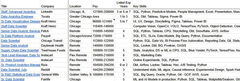
I then parsed that information just a little further by cleaning the pay ranges into minimum and maximum values. =SPLIT(pay, "-")
Looker studio is a free version of Looker that has direct access to google sheets data and is accessible via the extensions menu.
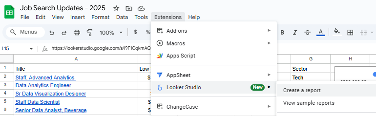
This forges a direct connection to the google sheets page & allows you to just “refresh” your looker visual when new rows are added to the table. Pretty nice for being totally free.
All we needed here was a simple visual to display the salary ranges.
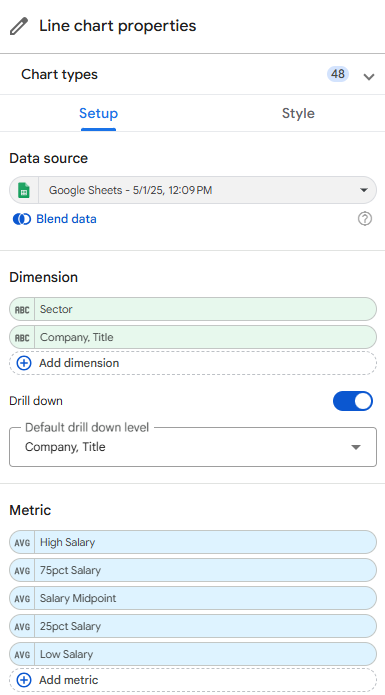
To get a sense of their relative bands, I went with a box plot chart for the quartiles in each listed salary range.
This required some fiddling with the settings but I eventually found that I could create some calculated fields and use the box plot chart. Since the data I’m using are just 1 row per salary, I needed to use a bit of DAX to generate my metrics.
For each 25 pctile: ((High Salary-Low Salary)*<pctile>)+Low Salary
Then, the dimensions for drilling down I had were sector (A field I inferred from the title manually in the google sheet) and Company, Title another DAX field just doing: CONCAT(Company,", ",Title).
Here’s what the final setup looked like:
Next we added some Style by adding reference lines and bands for the full visual. Meaning each salary belongs to the set of salaries, and we can add a band for the average 25pct and 75pct (the interquartile range or IQR) for the entire dataset. This plus my last base salary as a parameter added some context to the visual.
What I like most about the finished product is the ability to quickly see a breakdown for the full dataset as well as for each industry that I labeled. Here’s that drilled up view.
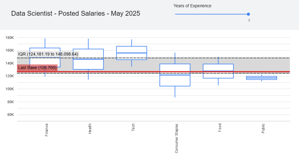
In the visual we can see how tech salaries are generally higher, and food and public sectors are lower. Part of the reason for this is the bias I have on jobs that look interesting, but I think the trend would hold relatively well.